Hello again, every one!
I’m back again this week to tell you about the progress we’ve been making in our school project.
I’m Peo Johansson and I’m studying video game design and graphics at Uppsala University – Campus Gotland. I’m currently a part of a six-member team undertaking a school assignment.
You can read about what the specifics of said project in the first blog entry.
Now then, onto the detailing of last week’s work!
One of the artifacts that I worked on last week was a number of icons that will represent the power ups that will be in the game.
One of the power ups is a firework that the player can use to take out multiple enemies at once. It is a more powerful attack than the default shooting ability, with a so-called “area of effect”.
After being tasked with undertaking the creation of these assets, I started sketching up a few possible visual directions that I could take with the power up icons. I did this with the firework ability, as it was the one that was the most urgent and I wanted to be sure that it would be completed as quickly as possible. You can see some of the designs that I produced below.
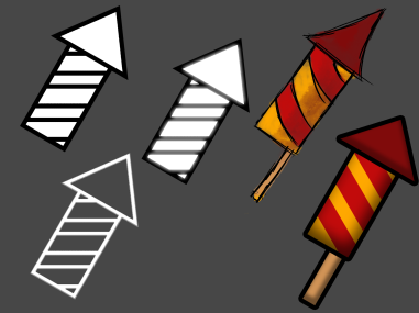
The purpose of the icons was to not only represent the power ups on the game levels in their state where they would be able to be picked up by the player, but also in the game HUD to communicate to the player which power ups are available for use. As such, I wanted them to be as clear and distinct as possible, and aimed to create a minimalistic design that aimed more at basic shapes than at realistic details.
After running the produced concepts past the lead artist on our team, I decided on a more concrete direction for the design of the icons.
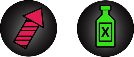
After creating the design for the firework power up icon, I went on to start work on another ability called “Moonshine”. I made extra care to make sure that the line work of the two icons was of equal thickness, so that the icons would have a shared visual uniformity in their design.
In the process of working on both power up icon designs, I also decided to color code them to further make them easy to tell apart at a glance. After all, it was important for the player to be able to informed decisions as quick as possible while playing the game, even as the in-game camera is auto-scrolling at a moderate speed.
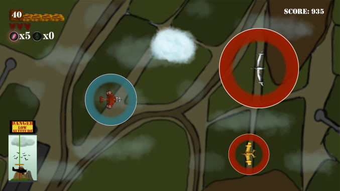
While the icons isn’t implemented into the game engine as of writing this blog post, below you can see a mockup of how the icons would be used in-game (some other in-game elements outdated).

Hi there, Peo!
First and foremost: Good work! The icons looks nice and crisp. While I understand what the fireworks do, you do not describe what the moonshine does. Even though it’s not the main subject, but it would be nice to know as you bring up the that icon too. One other VERY minor thing that I have to say is that the usual characeristic for moonshine bottles is three X’s, but I get the idea with just one X.
It’s very nice to be able to see the process of the artefacts creation and the different results you got, not only the finished product.
Overall the spelling and structure is fine, but there are some sloppy mistakes. One instance of it, for example, is that you wrote “I made extra care” wich should probably be more something like: “I put extra care into”.
In “it was important for the player to be able to informed decisions” you forgot to add “make”.
In “While the icons isn’t implemented” I belive there should be a “aren’t” instead of “isn’t”, as “icons” are a plural noun.
Despite that, I got everything that you wanted to say and it flowed naturally from beginning to end. I hope everything goes well!
//Daniel Qvarnemark.
LikeLiked by 1 person